
在上篇中 CSS 参考线 中已经讲过line-height设置数值改变 参考线 上下两个 间隙 gap的高度来实现文本间距改变的效果。 line-height是可以被子元素所继承,这就意味父元素设置了 line-height,子元素在不设置 line-height 也同样有着父元素 line-height的效果。
回顾 line-height
在上篇中 CSS 参考线 中已经讲过line-height设置数值改变 参考线 上下两个 间隙 gap的高度来实现文本间距改变的效果。 line-height是可以被子元素所继承,这就意味父元素设置了 line-height,子元素在不设置 line-height 也同样有着父元素 line-height 的效果。
而 line-height 的取值方式主要有如下几种:
- 关键词,比如 normal(字体默认的间隙 gap取值,但会根据浏览器的默认取值改变)、inherit(继承自父元素的line-height)等。
- 长度单位,比如 px、em 单位的像素值。以 em 为单位的值可能会产生不确定的结果。
- 数字,line-height 取值 = 数字 乘以 该元素的字体大小。数字不会在继承时产生不确定的结果。(推荐)
- 百分比,与元素自身的字体大小有关。计算值是给定的百分比值乘以元素计算出的字体大小。百分比值可能会带来不确定的结果。
line-height 效果
在实际的 CSS应用中,我们使用line-height的作用大多数实现上下居中的效果。在日常开发中,我们使用最多的取值方式是长度单位和数字。而取值为长度单位时,如果该容器内的 高度 height = line-height 行高 的话,可以实现文本上下居中效果。 下面进行数字、长度单位、百分比的效果比较:
<!DOCTYPE html>
<html lang="en">
  <head>
    <meta charset="UTF-8" />
    <title>line-height对比</title>
    <style>
      .green {
        line-height: 1.2;
        border: solid limegreen;
      }
      .red {
        line-height: 1.2em;
        border: solid red;
      }
      .blue {
        line-height: 120%;
        border: solid blue;
      }
      h1 {
        font-size: 30px;
      }
      p {
        font-size: 10px;
      }
      .box {
        width: 18em;
        display: inline-block;
        vertical-align: top;
        font-size: 16px;
      }
    </style>
  </head>
  <body>
    <div class="box green">
      <h1>Avoid unexpected results by using unitless line-height.</h1>
      length and percentage line-heights have poor inheritance behavior ...
      <p>Lorem ipsum dolor sit amet, consectetur adipisicing elit. A, rerum!</p>
    </div>
    <div class="box red">
      <h1>Avoid unexpected results by using unitless line-height.</h1>
      length and percentage line-heights have poor inheritance behavior ...
      <p>Lorem ipsum dolor sit amet, consectetur adipisicing elit. A, rerum!</p>
    </div>
    <div class="box blue">
      <h1>Avoid unexpected results by using unitless line-height.</h1>
      length and percentage line-heights have poor inheritance behavior ...
      <p>Lorem ipsum dolor sit amet, consectetur adipisicing elit. A, rerum!</p>
    </div>
  </body>
</html>
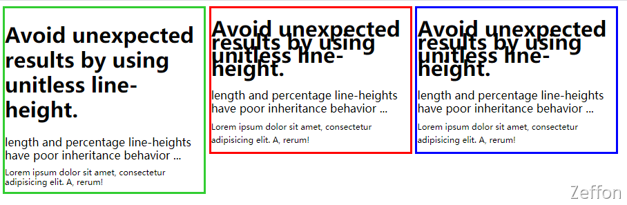 从上面的列子可看出,采用 数字 1.2、长度单位 1.2em、百分比 120%,h1 元素 设置为32px,div 元素设置16px,p 元素设置10px,很明显三者的 div 元素 文本间距是相同,但 h1 元素 和 p 元素 的文本间距只有数字符合理想的间距效果。
差异的原因
由于行高 line-height 是可以继承父级别以上的元素。所以在使用数字、长度单位、百分比时,是有差异的。以上述例子进行对比:
- 数字 先继承, 再计算像素值
先继承div 元素的 line-height系数为 1.2,再乘以 字体大小 16px 获得计算后的数值。
| element | font-size | line-height | 计算后的 line-height |
|---|---|---|---|
| div | 16px | 1.2 | 16px * 1.2 = 19.2px |
| h1 | 32px | 1.2 | 32px * 1.2 = 38.4px |
| p | 10px | 1.2 | 10px * 1.2 = 12px |
- 长度单位 先计算像素值, 再继承
先获取计算子元素本身的line-height,再从父元素div 元素继承line-height数值 1.2em(19.2px) 会被继承,所有继承下来的元素会忽略本身的line-height,而使用的是继承自父元素line-height。
| element | font-size | line height | 计算后的 line-height |
|---|---|---|---|
| div | 16px | 19.2px | 19.2px |
| h1 | 32px | 19.2px | 19.2px |
| p | 10px | 19.2px | 19.2px |
- 百分比 先继承, 再计算像素值
line-height 的百分比(120%)乘以 div 元素 的 文字大小 16px 的数值(16px * 120%=19.2px)。这个计算出来的值会被层叠下去的元素所继承。所有继承下来的元素会忽略本身的line-height,而使用的是计算出来的 line-height。
| element | font-size | line height | 计算后的 line-height |
|---|---|---|---|
| div | 16px | 120% | 16px * 120% = 19.2px |
| h1 | 32px | 120% | 19.2px |
| p | 10px | 120% | 19.2px |